[loading]
Software
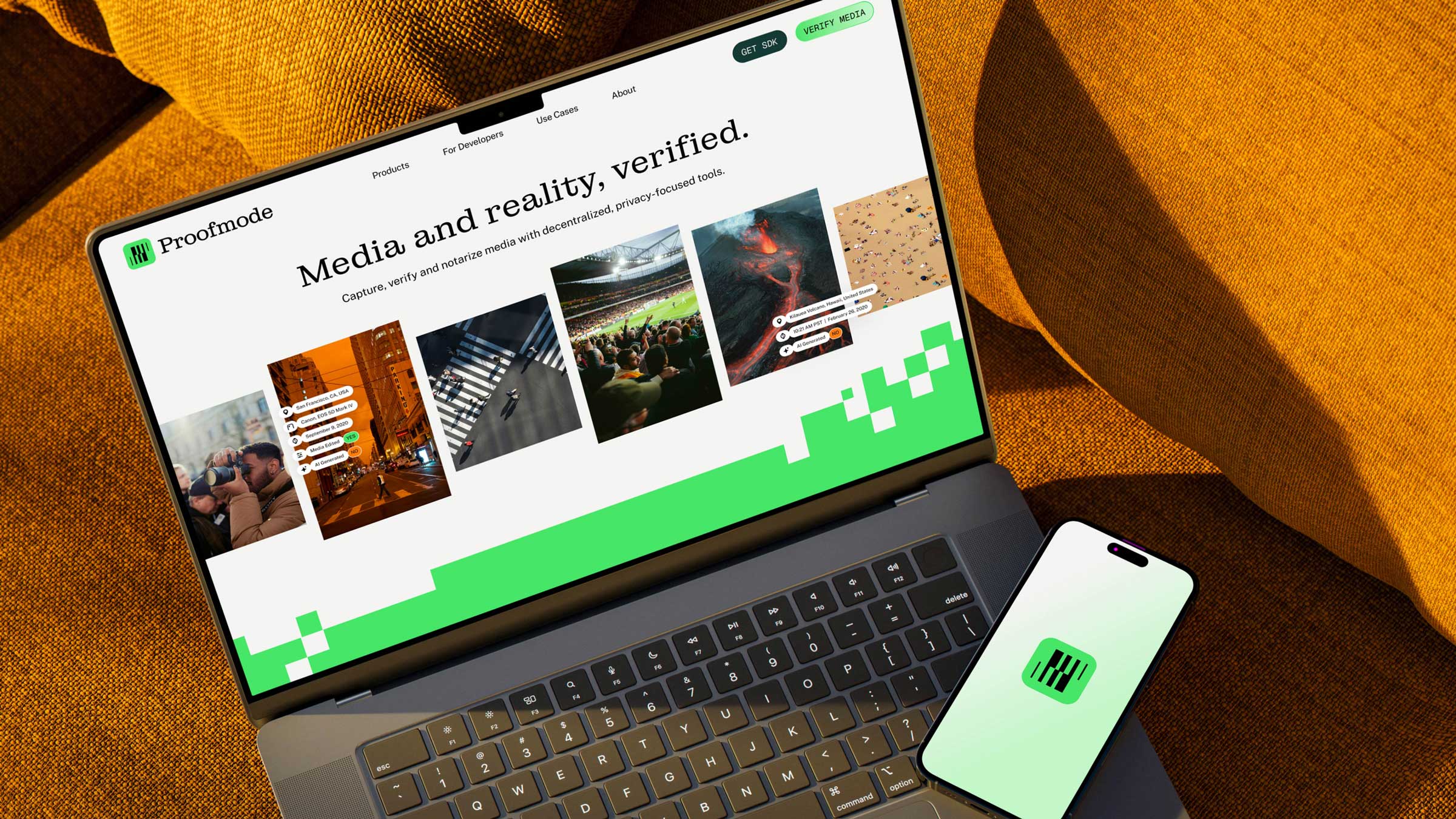
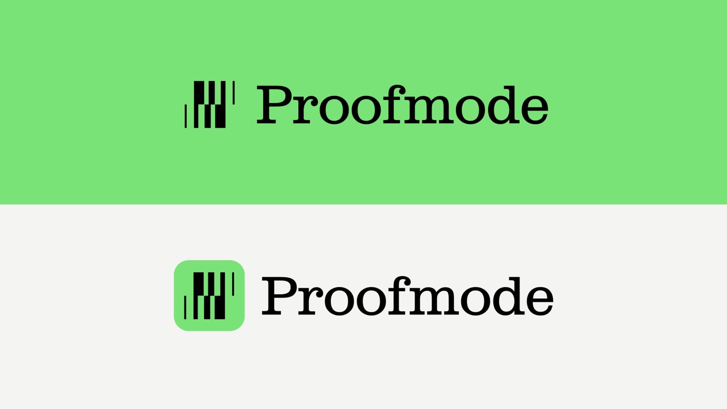
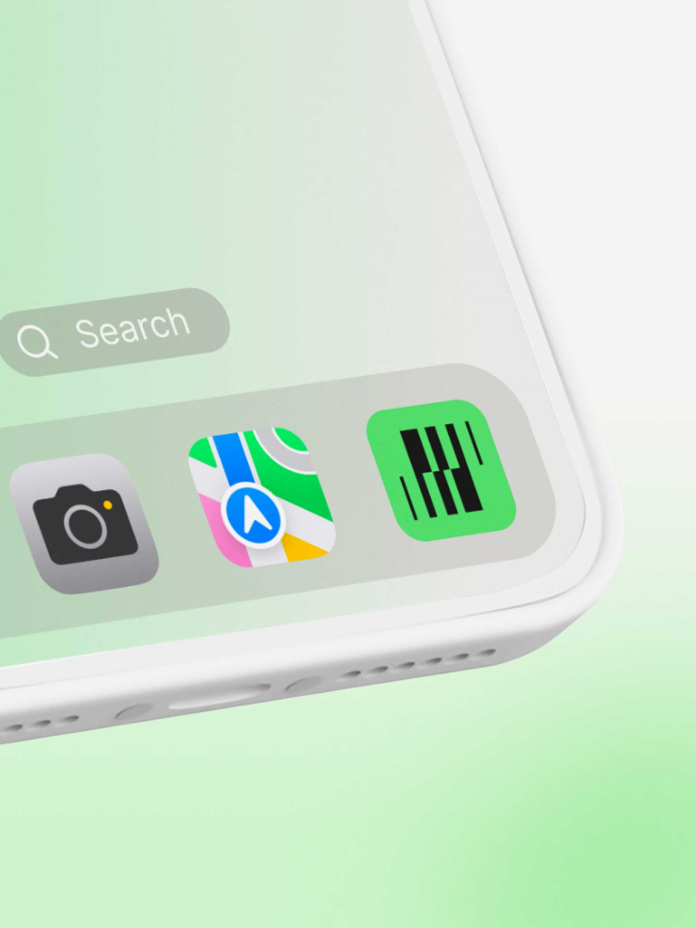
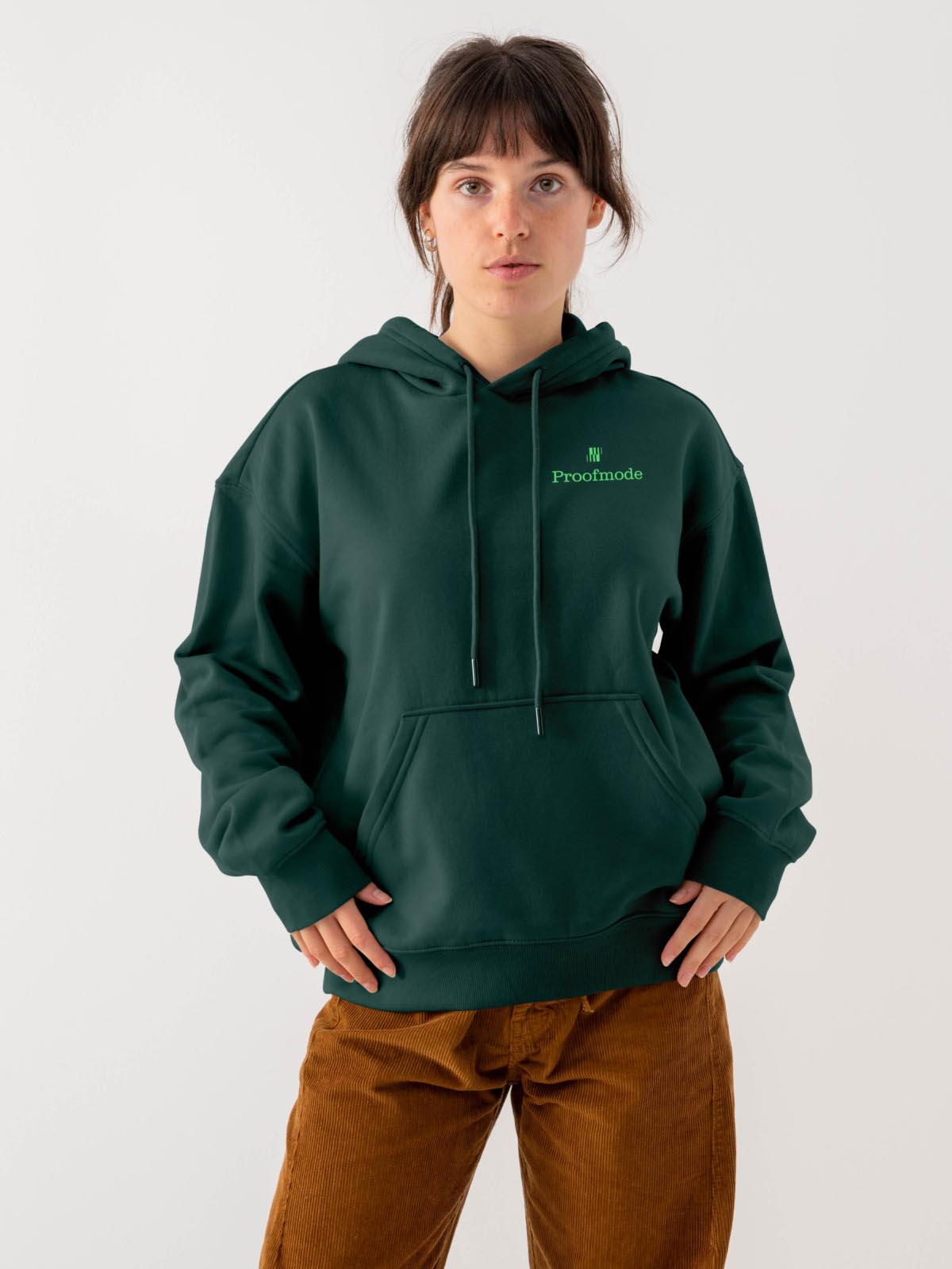
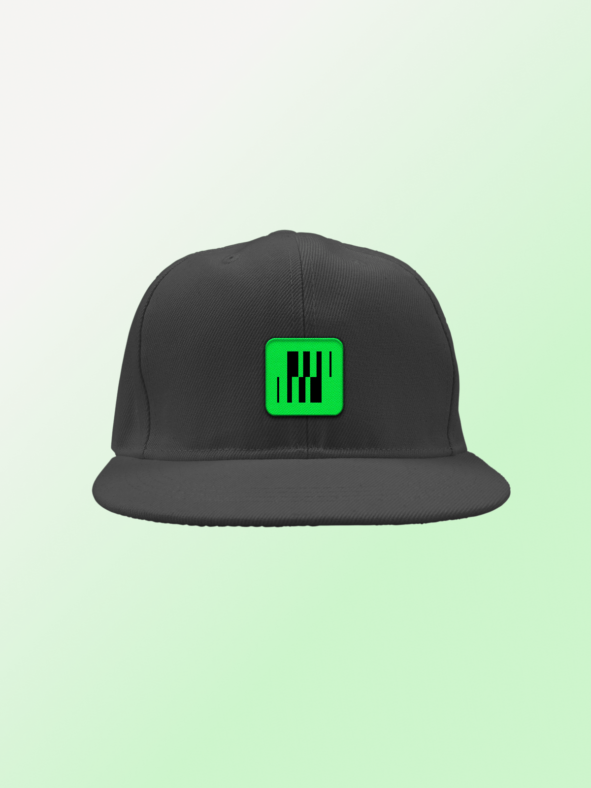
Proofmode
by Hoodzpah
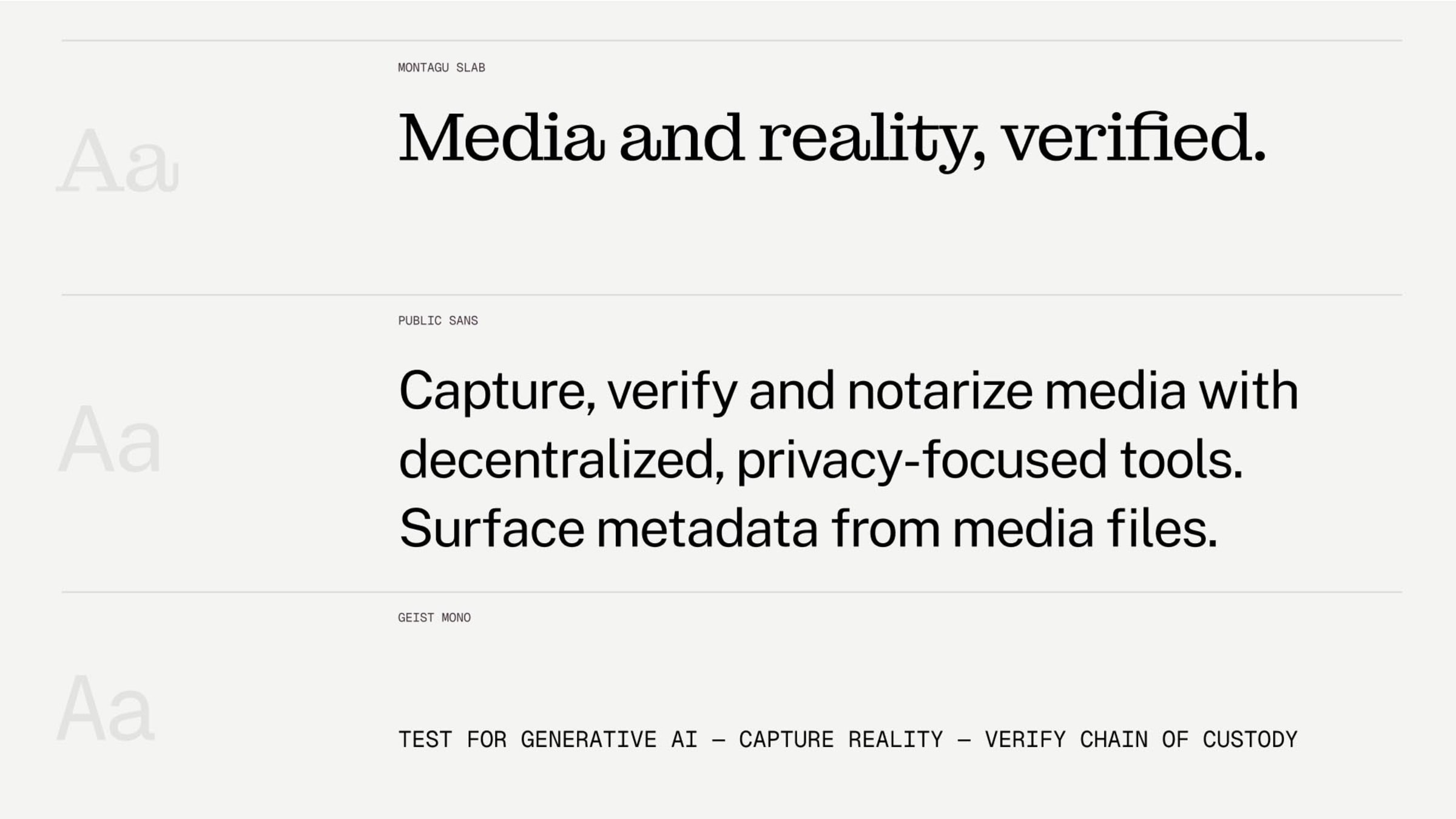
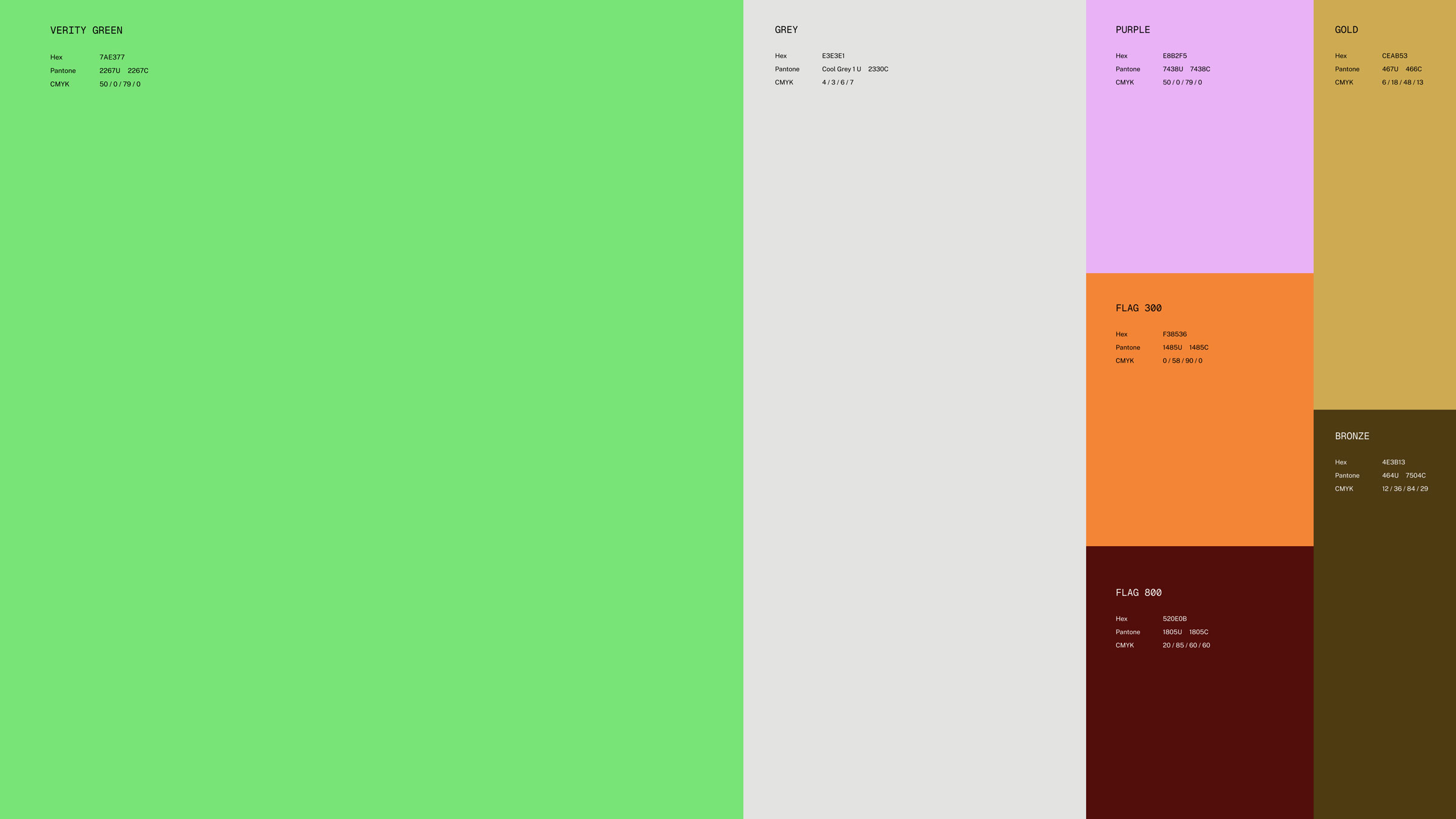
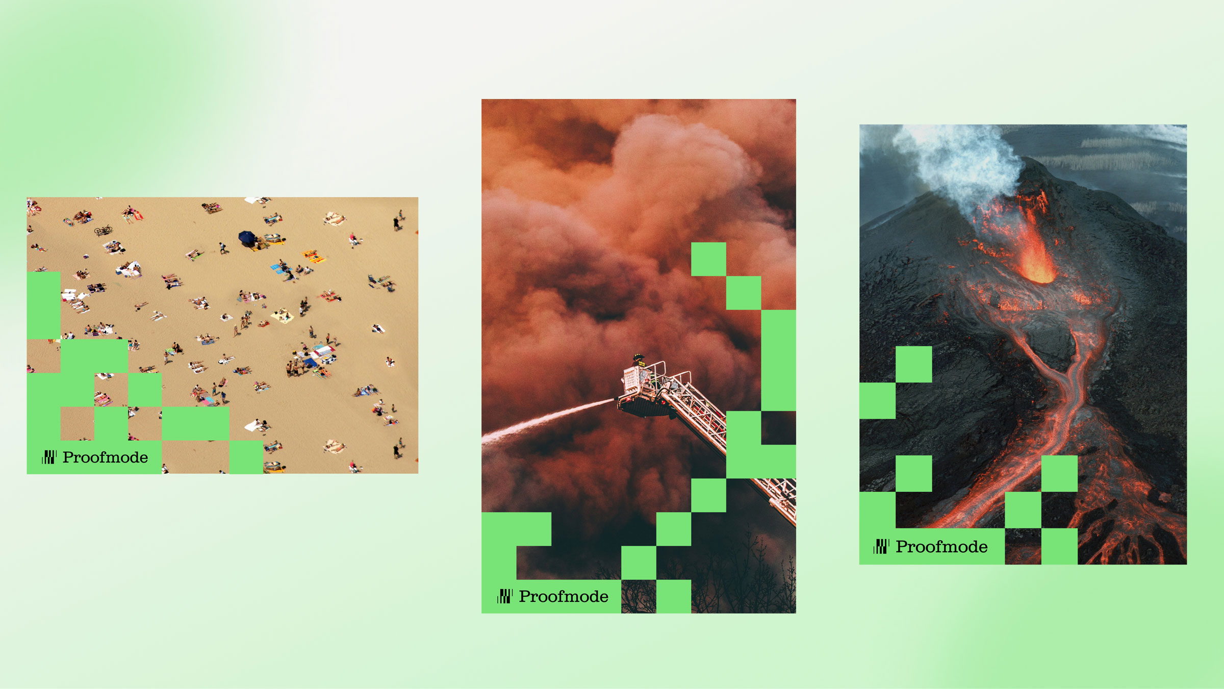
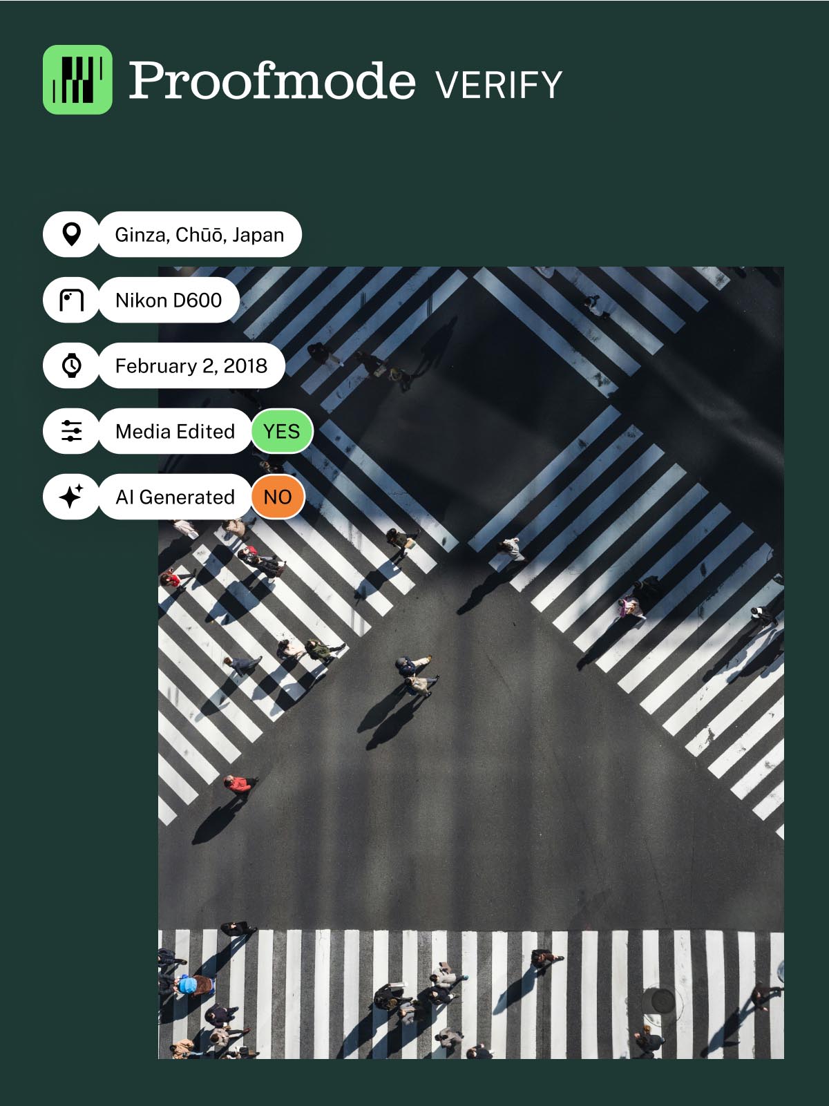
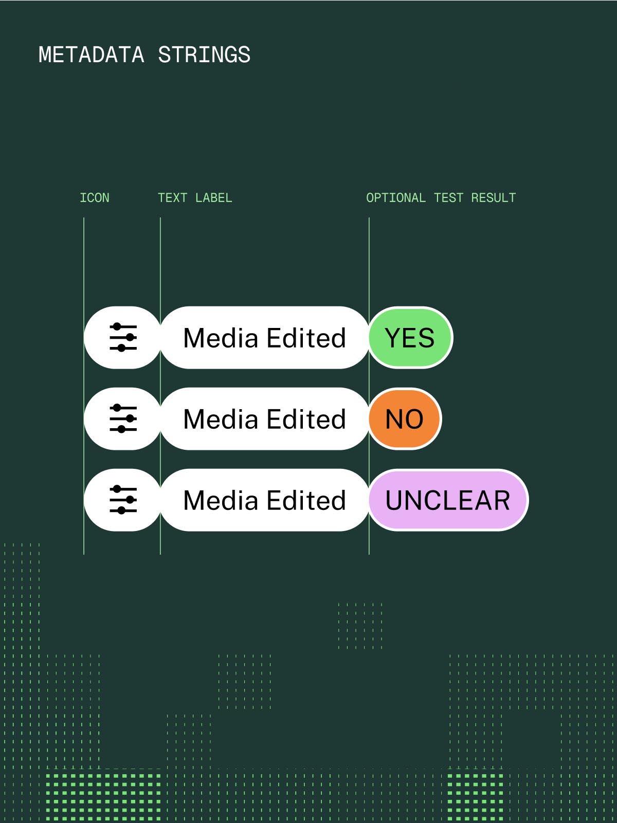
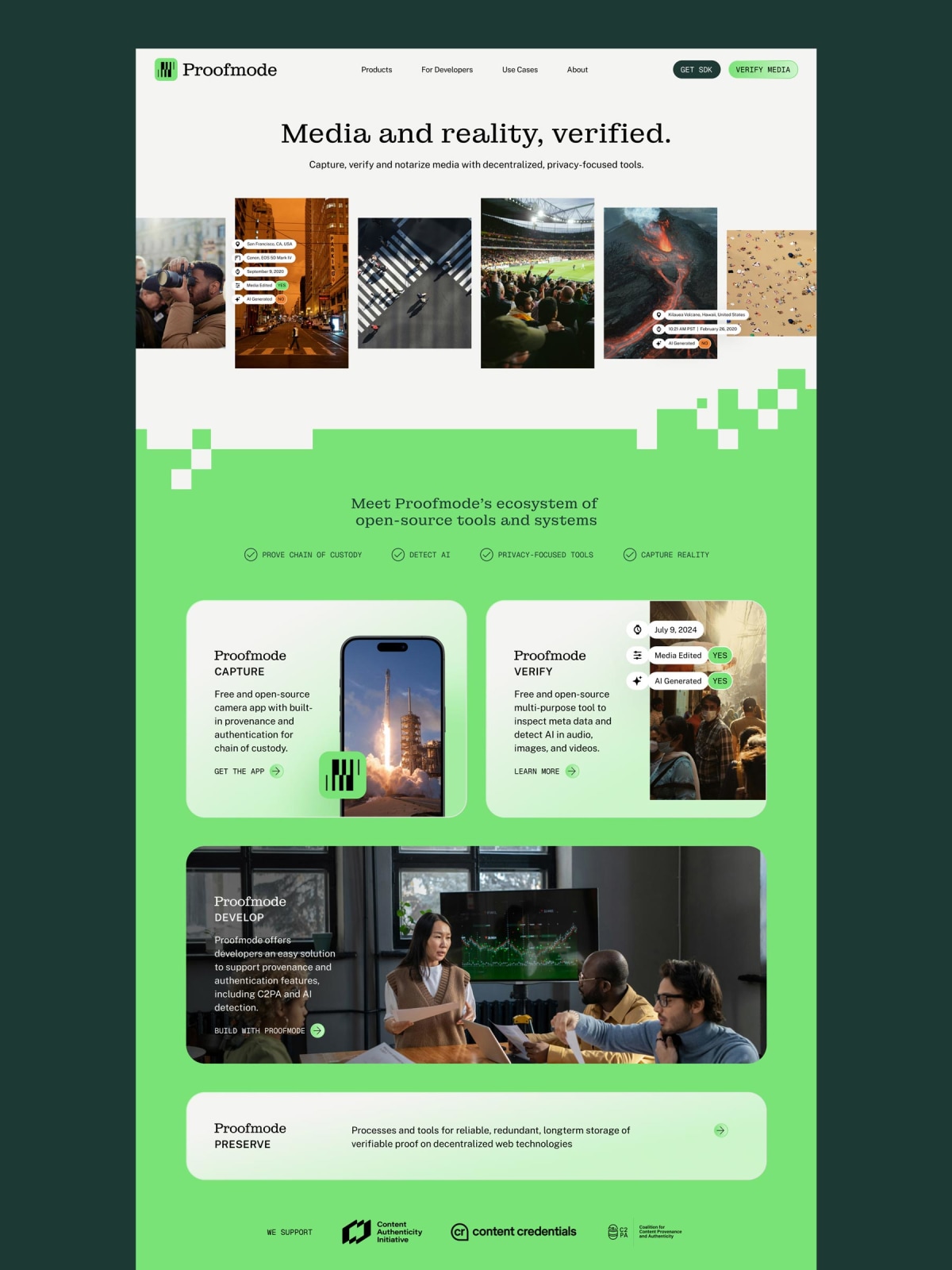
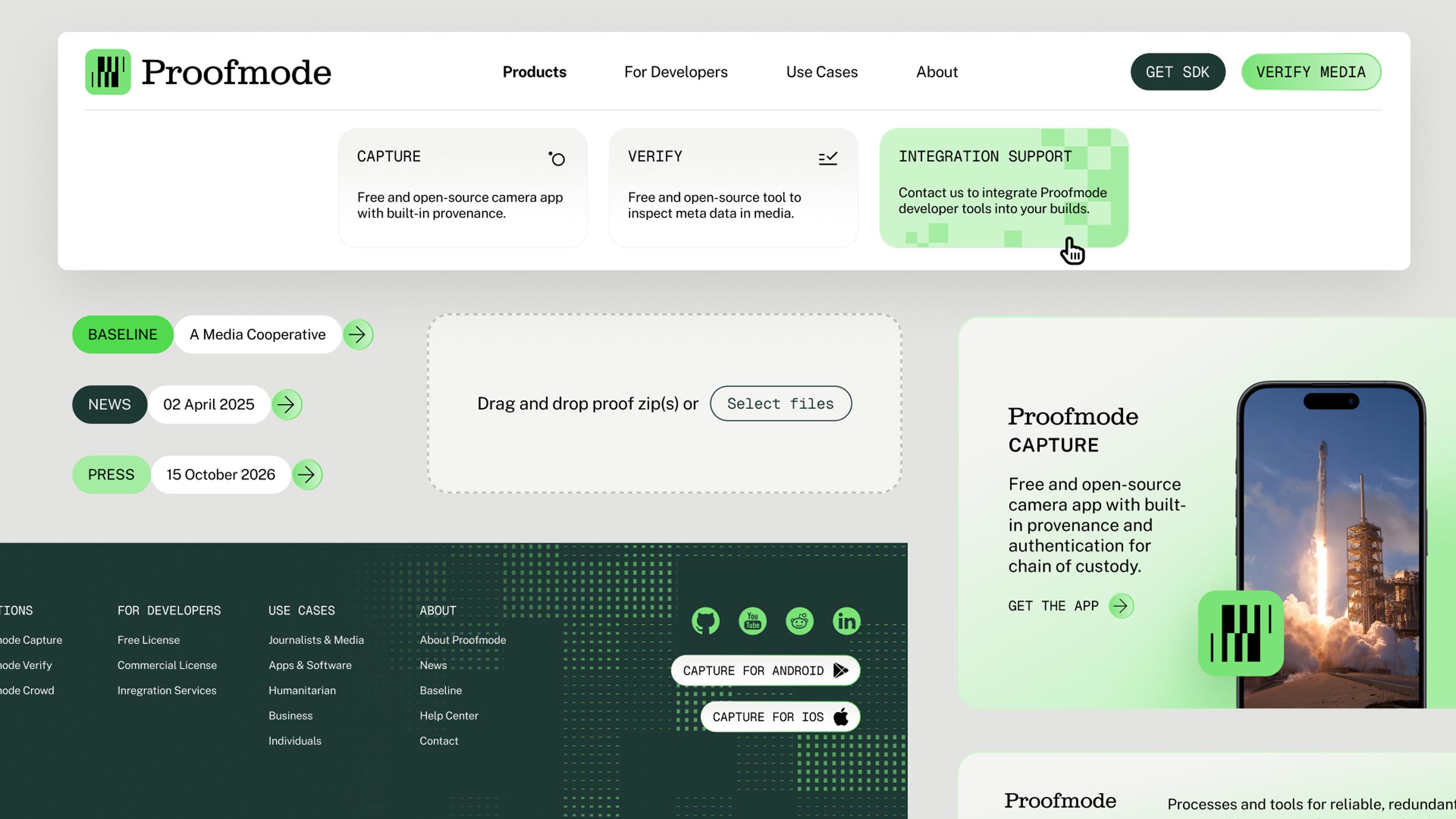
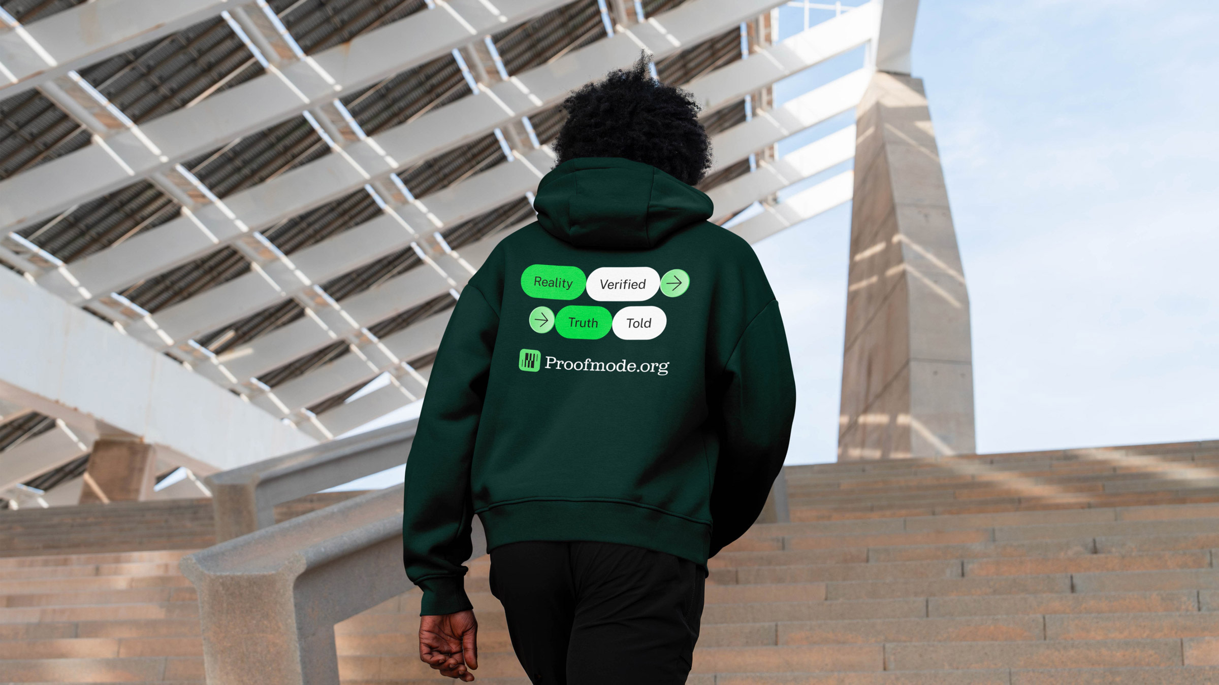
This Proofmode rebrand uses a slab serif wordmark paired with an abstract, data-inspired icon. The slab serif provides a trustworthy, journalistic feel, contrasting with the tech-focused product. Integrating pixelated graphics injects a subtle tech vibe, avoiding overt corporate aesthetics. It's a smart blend of classic typography with digital visual cues, making the brand feel both reliable and forward-thinking.